← Back to work
Biz4Sale: From research to production
End-to-end UX/UI design and Angular development for Israel's business marketplace - connecting buyers, sellers, and brokers through a platform I designed and built alone.
The Challenge
Biz4Sale needed a platform serving three completely different audiences simultaneously: young first-time buyers, mid-career professionals diversifying income, and experienced investors planning retirement. Each group has different motivations, trust thresholds, and digital literacy.
The platform also needed to work in Hebrew — RTL layout, Israeli market context, and trust signals that resonate locally.
Research
Three audiences, six personas.
I started with audience research before touching Figma. Three segments emerged:
Young Adults (20–30): Post-military, entrepreneurial, limited capital. Need guidance and education.
Mid-Career Professionals (31–45): Diversifying income, time-constrained. Need financial clarity and efficiency.
Experienced Professionals (46–55): Risk-averse, prefer personal contact. Need trust signals and transparency.
I started with audience research before touching Figma. Three segments emerged:
Young Adults (20–30): Post-military, entrepreneurial, limited capital. Need guidance and education.
Mid-Career Professionals (31–45): Diversifying income, time-constrained. Need financial clarity and efficiency.
Experienced Professionals (46–55): Risk-averse, prefer personal contact. Need trust signals and transparency.
Six detailed personas were developed across these segments, each with goals, pain points, and a mapped customer journey from Awareness through Advocacy.
Competitor analysis revealed no existing Israeli platform was serving all three audiences with appropriate trust signals. Most were broker-focused or too informal - leaving a clear gap.
Competitor analysis revealed no existing Israeli platform was serving all three audiences with appropriate trust signals. Most were broker-focused or too informal - leaving a clear gap.

Personas Research
Click image to enlarge · Press ESC to close
UX Design
Wireframing the full flow.
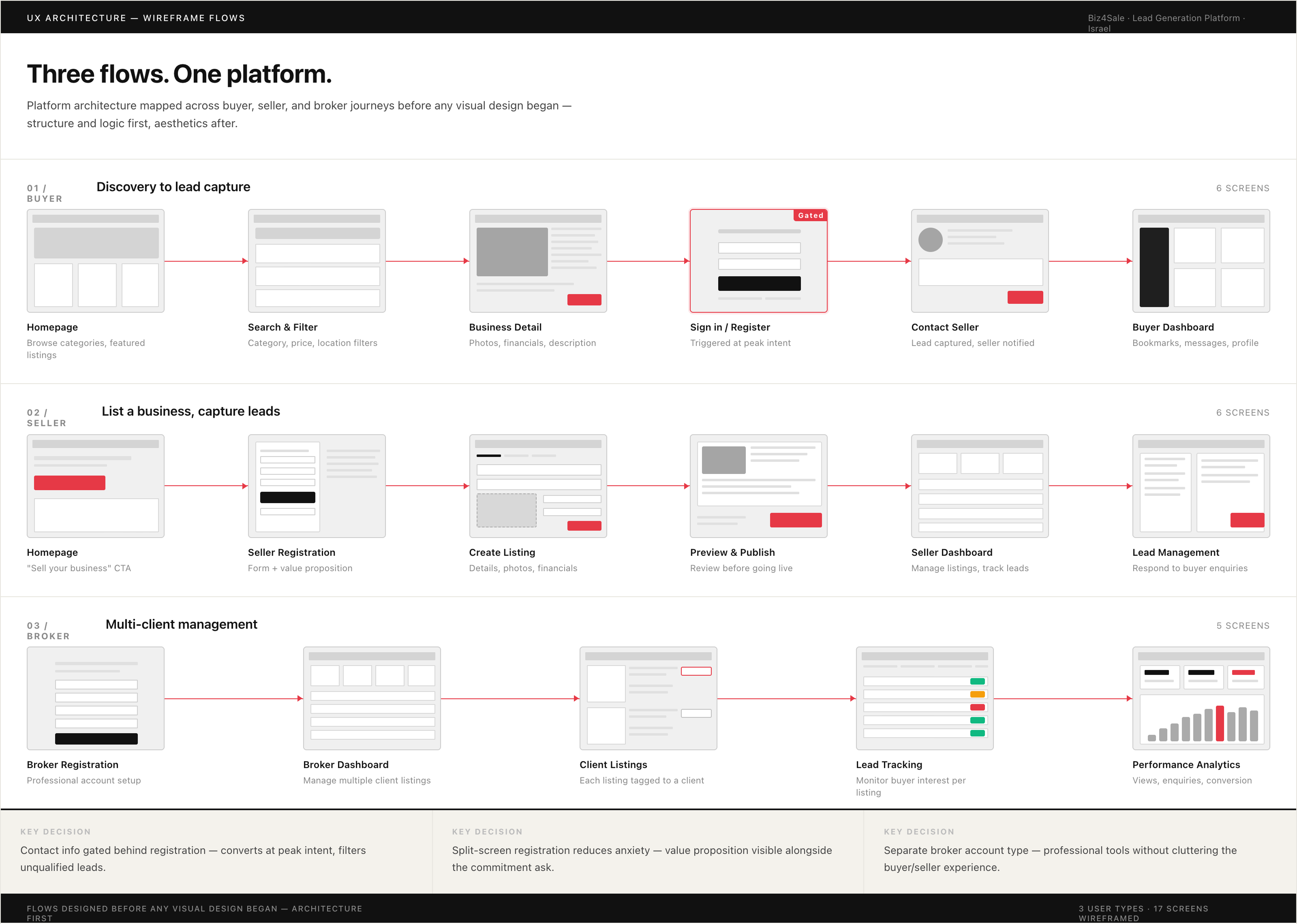
Before any visual design, I mapped the complete platform architecture across four core flows: browse and buy, sell a business, broker management, and user dashboards.
Key decisions:
Dual-role accounts: Users can switch between buyer and seller roles - mirroring how the Israeli market actually works, where many owners are simultaneously looking for their next venture.
Gated contact information: Seller details visible only after registration. Filters casual browsers, delivers qualified leads to sellers.
Progressive disclosure: Listing pages reveal information in the order a serious buyer evaluates a business -photos first, financials next, full description, then contact.
Before any visual design, I mapped the complete platform architecture across four core flows: browse and buy, sell a business, broker management, and user dashboards.
Key decisions:
Dual-role accounts: Users can switch between buyer and seller roles - mirroring how the Israeli market actually works, where many owners are simultaneously looking for their next venture.
Gated contact information: Seller details visible only after registration. Filters casual browsers, delivers qualified leads to sellers.
Progressive disclosure: Listing pages reveal information in the order a serious buyer evaluates a business -photos first, financials next, full description, then contact.
Main Flows UX
Click image to enlarge · Press ESC to close
UI Design
Dark navy and gold.Color choices in a high-stakes marketplace aren't arbitrary. Navy signals financial credibility. Gold signals opportunity. Together they communicate: serious platform, real value.
Key screens:
Homepage: Category browsing, featured listings, clear dual CTA (Buy a Business / Sell Your Business)
Listing cards: Photo-first, essential financials visible without clickingListing detail: Progressive reveal with gated contact CTA
Seller registration: Split screen — form left, value proposition right (Wide Reach, No Commission, Trusted Platform)
Login modal: Appears inline at peak intent — when buyer clicks "Contact Seller"
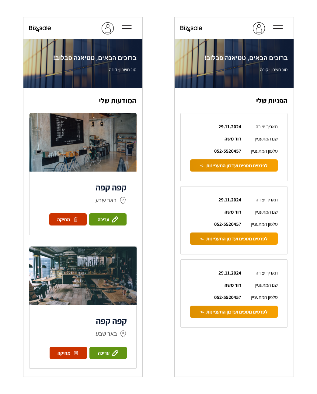
Seller dashboard: Active listings, views, enquiries, drafts
Buyer dashboard: Bookmarked listings, messages, profile
Key screens:
Homepage: Category browsing, featured listings, clear dual CTA (Buy a Business / Sell Your Business)
Listing cards: Photo-first, essential financials visible without clickingListing detail: Progressive reveal with gated contact CTA
Seller registration: Split screen — form left, value proposition right (Wide Reach, No Commission, Trusted Platform)
Login modal: Appears inline at peak intent — when buyer clicks "Contact Seller"
Seller dashboard: Active listings, views, enquiries, drafts
Buyer dashboard: Bookmarked listings, messages, profile

UI Design
Click image to enlarge · Press ESC to close
.png)
Biz4Sale Home Page
Click image to enlarge · Press ESC to close
.png)
Biz4Sale Seller Panel - listing a new business
Click image to enlarge · Press ESC to close
Biz4Sale Seller Panel - mobile
Click image to enlarge · Press ESC to close
Mobile
All layouts designed for both desktop and mobile with full RTL Hebrew support.
Key mobile adaptations: sticky contact CTA on listing pages, bottom sheet filters, single-column listing cards. RTL required careful attention throughout - icon direction, text alignment, reading flow assumptions, and form field direction all need to flip for Hebrew.
Key mobile adaptations: sticky contact CTA on listing pages, bottom sheet filters, single-column listing cards. RTL required careful attention throughout - icon direction, text alignment, reading flow assumptions, and form field direction all need to flip for Hebrew.
Angular Development
I didn't hand off this project - I built it. Working in Angular, I implemented the full platform:
component architecture, RTL layout, dynamic listing pages with search and filtering, authentication flows (email + Google Sign-in), dual dashboards with role switching, image upload, and lead capture forms. Design-to-development handoff was zero. When design changed, I updated the code. No translation loss, no miscommunication, no waiting.
component architecture, RTL layout, dynamic listing pages with search and filtering, authentication flows (email + Google Sign-in), dual dashboards with role switching, image upload, and lead capture forms. Design-to-development handoff was zero. When design changed, I updated the code. No translation loss, no miscommunication, no waiting.