Building a Scalable UI System for Trading SaaS Product
UX/UI DesignOverview
Role: Lead UX/UI Designer & Design System Consultant
Duration: 6 weeks
Product type: FinTech / Trading SaaS
Scope: Design system foundation → Colors, Typography, Spacing, UI Patterns
Deliverables: Color palette refactor, type scale, spacing system, UI audit, documentation, Figma library, dev guide
Background - When a Product Grows Without a System
I joined the product at a phase where functionality was evolving quickly, but UI foundations had never been formalized.
Different developers added styles “as needed”, which led to:
- 40+ nearly identical gray colors
- 3 different fonts and 10+ random text sizes
- inconsistent spacing and layout logic
- duplicated UI patterns, buttons, cards, table styles
- no documentation or visual source-of-truth
The product worked - but scaling it further meant increasing chaos.
My goal wasn't to redesign visually, but to organize, standardize, and create a scalable design foundation without changing how the product feels for users.
The Hidden Challenge of FinTech UI
Unlike consumer interfaces, trading platforms have unique characteristics:
- dense screens, lots of numbers, minimal whitespace
- users are trained to scan data like tables and excel sheets
- speed and information density matter more than visual spaciousness
This means the design system must be built around:
- compact typography
- tight spacing
- high readability on busy screens
- subtle UI harmony instead of expressive aesthetics
The system must be more practical then pretty — optimized for professionals who stare at the interface 6+ hours a day.
Discovery & Audit Phase
What I analyzed:
Focus Area
What I Found
Color Library
40+ shades of gray, duplicates, no naming logic
Typography
multiple fonts, inconsistent headers & paragraph sizes
Spacing & Layout
random paddings from 4px to 32px, no scale
Components
similar UI patterns built differently
UX Consistency
uneven hierarchy, inconsistent form/table layouts
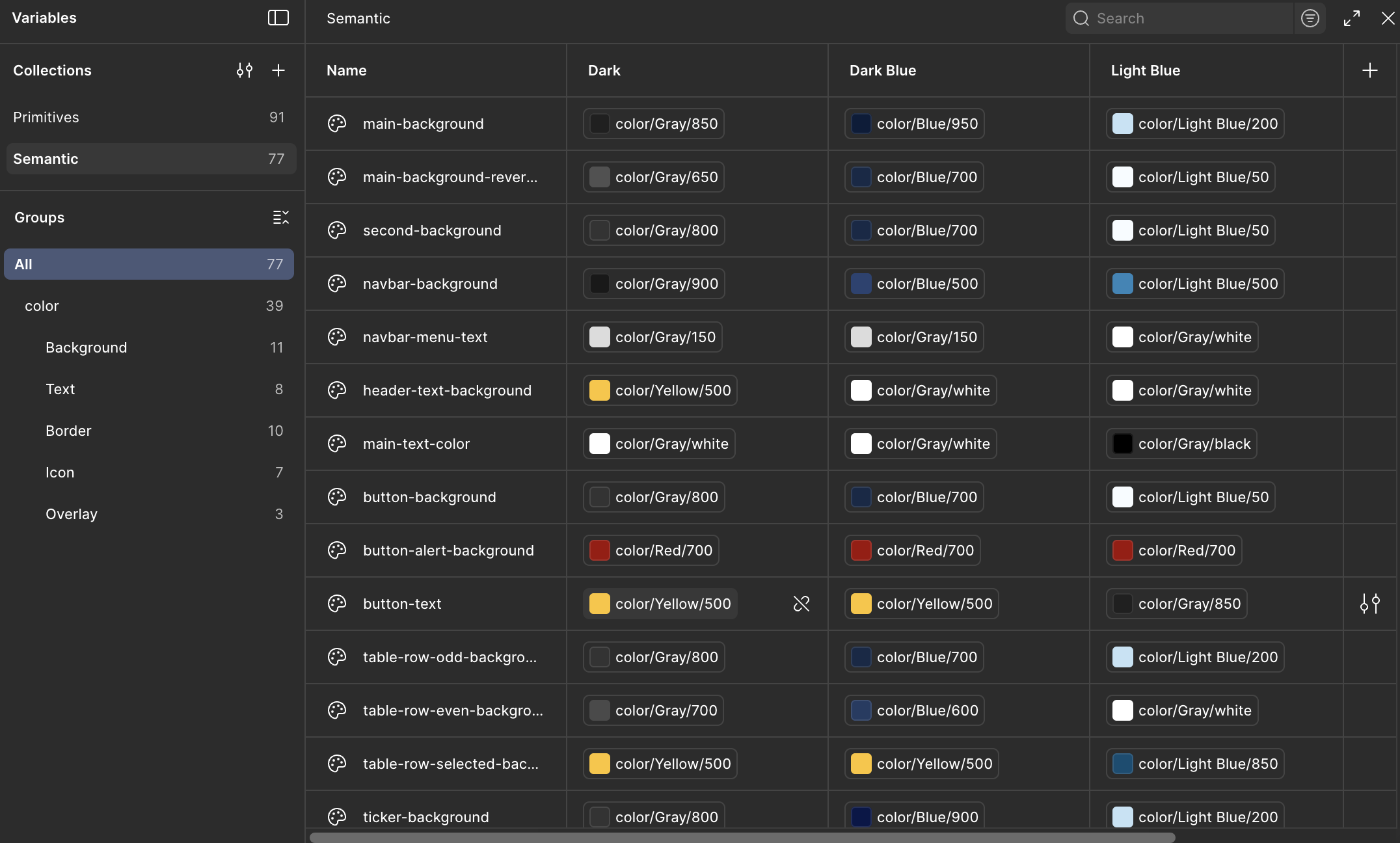
Color System Redesign - From Chaos to 7 Core Grays
Step-by-step approach:
Imported all HEX colors from CSS into Figma
Grouped visually similar colors
Mapped duplicates into a 7-shade grayscale system
Used a Tailwind-like naming approach (gray-100/200/300…)
Replaced values gradually through a separate branch
Tested in staging to ensure no visible UI changes
Result: visually identical product, but drastically cleaner code + future scalability.
Choosing the Right Font for Trading UX
After researching UI patterns of Bloomberg, TradingView, IBKR, eToro and internal screens,I concluded:
FinTech UI must prioritize legibility in density, not decorative aesthetics.
Therefore:
Element
Final Choice
Why
Font
Open Sans
already in codebase, neutral, highly readable
Base Paragraph
14px
readable on dense numerical screens
Headers
20px
enough contrast without breaking density
Line Height
120–140%
crisp in grids and tables
Instead of introducing something new, I strengthened what existed - ensuring low friction for developers and minimal UI shift for users.
Spacing & Layout System - Compact, but Structured
FinTech ≠ airy UI. Space must be present, but disciplined.
I introduced a minimal modular scale:
8 / 12 / 16 px
8px — base unit for dense UI
12px — internal block spacing
16px — container + section padding
This immediately improved alignment and readability without increasing visual space.
Systemization & Handoff
To integrate changes smoothly across the team, I created:
- Design System Library in Figma
- Token tables: Colors, Typography, Spacing
- Dev-handoff documentation (before → after mapping)
- Component templates for tables, forms, cards, buttons
- Migration guide with mapping: Old HEX → New variable
- Team onboarding session + Q&A
The update became a shared language between designers and developers.
Results
Quantative:
Metric
Before
After
Grays
40+
7
Fonts used
3
1
Text sizes
10+
2 core + 2 auxiliary
Spacing units
random
3 scalable tokens
Qualitative:
- UI looks the same, but feels more consistent
- New screens are designed 2-3x faster
- Developers spend less time guessing colors/styles
- Design decisions are repeatable instead of personal
- Foundation ready for proper component library expansion
Key Lessons
- You don’t always need a visual redesign - sometimes cleanup = improvement
- Developers often build with intuitive logic - a system just formalizes it
- A good design system starts with reduction, not addition
- Respecting the nature of the domain (FinTech) creates better usability than importing trends
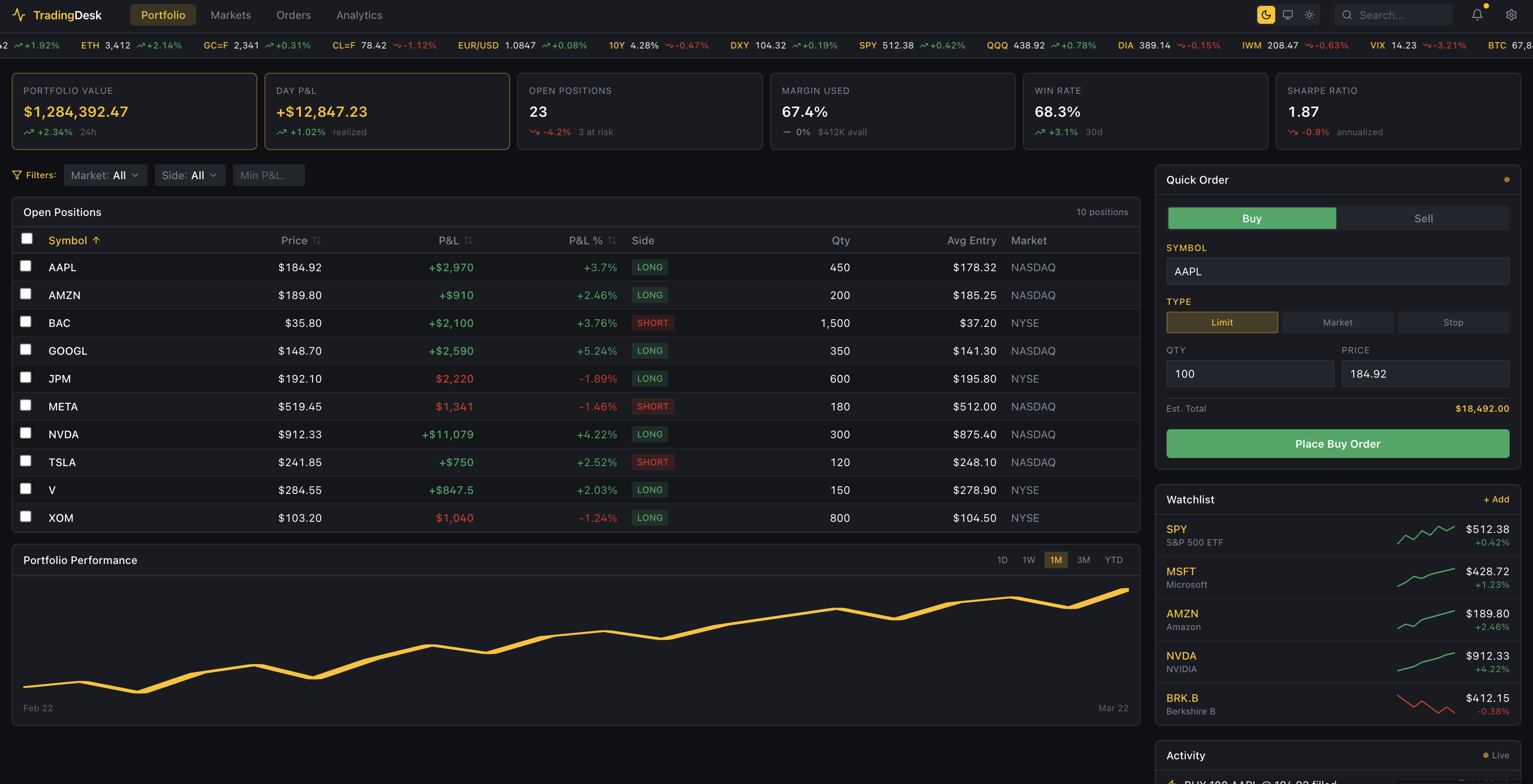
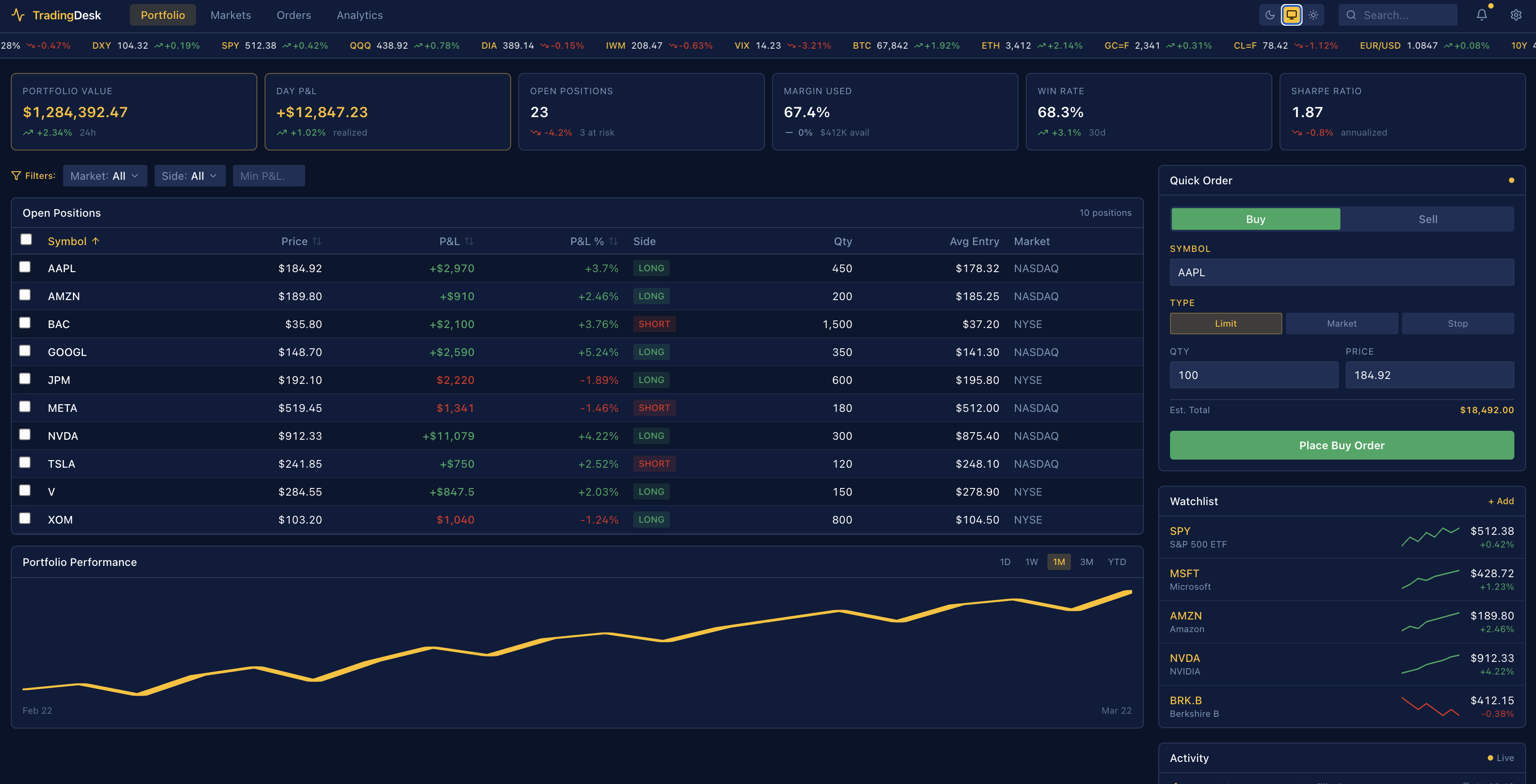
Reconstructed UI (AI-generated)
The original product interface is protected under NDA.These screens were generated with AI to accurately reflect the real system, layout, and design logic.

Design Tokens
Instead of introducing something new, I strengthened what existed - ensuring low friction for developers and minimal UI shift for users.
.svg)
%201.svg)