← Back to work
Fluent Trade: Building a design system from chaos
From 40+ shades of gray and 3 CSS libraries to a unified, themeable system with automated color tokens - all in 6 months as the solo designer
The problem
I joined Fluent Trade to cover a maternity leave and found a product that worked functionally - but the UI was held together with duct tape.
The visual design was a 2010s relic: heavy shadows, gradients, and skeuomorphic elements that felt dated. But the deeper issues were systemic:
Color chaos: 40+ shades of gray scattered across the codebase, with no logic or naming convention. Developers picked colors ad-hoc. The primary brand color was yellow, which failed contrast checks against white and light gray backgrounds - creating accessibility violations on nearly every screen.
No design system: Three different component libraries (Material UI, Ant Design, and custom-built components) coexisted on the same pages. Buttons looked different depending on which dev built that feature.
Four themes, zero consistency: The product supported a primary theme plus three white-label themes for enterprise clients. The alternate themes had contrast bugs (white text on white backgrounds) because no designer had audited them.
Typography free-for-all: Three different font families, no consistent size scale. Headers ranged from 14px to 28px with no pattern.
The visual design was a 2010s relic: heavy shadows, gradients, and skeuomorphic elements that felt dated. But the deeper issues were systemic:
Color chaos: 40+ shades of gray scattered across the codebase, with no logic or naming convention. Developers picked colors ad-hoc. The primary brand color was yellow, which failed contrast checks against white and light gray backgrounds - creating accessibility violations on nearly every screen.
Color chaos: 40+ shades of gray scattered across the codebase, with no logic or naming convention. Developers picked colors ad-hoc. The primary brand color was yellow, which failed contrast checks against white and light gray backgrounds - creating accessibility violations on nearly every screen.
Our UI is a mess of mixed colors. I want it fixed in some way.
- One of the Stakeholders
That became my mandate: bring order to chaos, in six months, alone.
UI Comparison - Before
Click image to enlarge · Press ESC to close
.png)
UI Comparison - After
Click image to enlarge · Press ESC to close
Research and Discovery
I spent the first two weeks forensically analyzing the product:
Production audit: I screenshotted every major screen across all four themes, documenting contrast failures, inconsistent spacing, and component mismatches.
Figma file audit: The design files were incomplete. Some screens existed in Figma, others were dev-only. Version control was non-existent.
CSS deep-dive: I extracted every color value from the stylesheets. The result: a spreadsheet with 40+ gray values (
Stakeholder interviews: I talked to the CTO, product managers, and lead developers. The consensus: the design debt was slowing down feature development. Devs spent hours tweaking colors to "look right" instead of building.
The white-label dilemma: New enterprise clients brought their own brand guidelines (colors, fonts, logos). Applying these changes was manual and error-prone — each new client required weeks of custom CSS work.
The core insight: this wasn't a visual redesign problem. It was a systems architecture problem.
Production audit: I screenshotted every major screen across all four themes, documenting contrast failures, inconsistent spacing, and component mismatches.
Figma file audit: The design files were incomplete. Some screens existed in Figma, others were dev-only. Version control was non-existent.
CSS deep-dive: I extracted every color value from the stylesheets. The result: a spreadsheet with 40+ gray values (
#e8e8e8, #ebebeb, #f0f0f0...) that were functionally identical but treated as separate colors in the code.Stakeholder interviews: I talked to the CTO, product managers, and lead developers. The consensus: the design debt was slowing down feature development. Devs spent hours tweaking colors to "look right" instead of building.
The white-label dilemma: New enterprise clients brought their own brand guidelines (colors, fonts, logos). Applying these changes was manual and error-prone — each new client required weeks of custom CSS work.
The core insight: this wasn't a visual redesign problem. It was a systems architecture problem.
Strategy & Approach
I made a strategic decision early: don't chase visual trends. Build a flexible, maintainable system that could support white-labeling at scale.
Principles:
1. Color consolidation: Reduce 40+ grays to 10 semantic shades. Name them using Tailwind's convention (
2. Accessibility-first: Every color pairing had to pass WCAG AA contrast (4.5:1 for body text, 3:1 for UI). This meant replacing the yellow primary with a deeper gold that worked on white backgrounds.
3. Theme-agnostic tokens: Instead of hardcoding
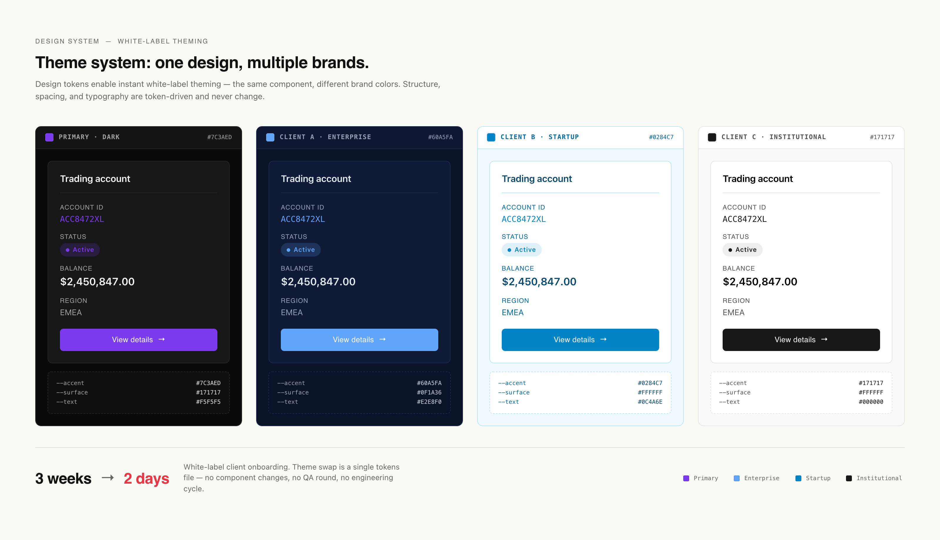
4. White-label constraints: Clients could customize brand colors, fonts, and logos — but spacing, sizing, and component structure stayed fixed. This ensured visual consistency across all themes while allowing brand flexibility.
5. Developer-friendly: Use naming conventions devs already know (Tailwind, CSS variables). Provide Figma tokens that auto-sync to code.
Principles:
1. Color consolidation: Reduce 40+ grays to 10 semantic shades. Name them using Tailwind's convention (
gray-100, gray-200...) so developers could reason about them intuitively.2. Accessibility-first: Every color pairing had to pass WCAG AA contrast (4.5:1 for body text, 3:1 for UI). This meant replacing the yellow primary with a deeper gold that worked on white backgrounds.
3. Theme-agnostic tokens: Instead of hardcoding
#1a1a1a, use a token like text-primary. In the primary theme, text-primary = black. In a client's white-label theme, text-primary = their brand navy.4. White-label constraints: Clients could customize brand colors, fonts, and logos — but spacing, sizing, and component structure stayed fixed. This ensured visual consistency across all themes while allowing brand flexibility.
5. Developer-friendly: Use naming conventions devs already know (Tailwind, CSS variables). Provide Figma tokens that auto-sync to code.
Execution
Phase 1: Color systemI created a base palette:
10 grays (100–900)
Primary brand colors (gold, replacing yellow)
Semantic colors (success green, error red, warning amber, info blue)
Each theme (primary + 3 white-label) got its own color token file.
I manually mapped every instance of the old 40+ grays to the new 10-shade scale in the CSS.
Phase 2: Component libraryI designed a unified set of UI primitives in Figma:
Buttons (primary, secondary, ghost) with hover/active/disabled states
Form inputs (text, select, checkbox, toggle)
Dropdowns and combo boxes
Cards, modals, toasts
Each component used design tokens, so switching themes was one click in Figma.
Phase 3: Figma tokens + CSS variables
I set up Figma's variable system (tokens) and wrote corresponding CSS custom properties:css
Phase 4: Documentation + developer handoff
I created a Figma library with:
Color tokens for each theme
Spacing tokens (4px grid: 4, 8, 12, 16, 24, 32, 48, 64)
Typography scale (12, 14, 16, 18, 20, 24, 32, 48)
Component usage guidelines.
I ran workshops with the dev team showing them how to use tokens instead of hardcoded values. We migrated components incrementally — no "big bang" rewrite.
10 grays (100–900)
Primary brand colors (gold, replacing yellow)
Semantic colors (success green, error red, warning amber, info blue)
Each theme (primary + 3 white-label) got its own color token file.
I manually mapped every instance of the old 40+ grays to the new 10-shade scale in the CSS.
Phase 2: Component libraryI designed a unified set of UI primitives in Figma:
Buttons (primary, secondary, ghost) with hover/active/disabled states
Form inputs (text, select, checkbox, toggle)
Dropdowns and combo boxes
Cards, modals, toasts
Each component used design tokens, so switching themes was one click in Figma.
Phase 3: Figma tokens + CSS variables
I set up Figma's variable system (tokens) and wrote corresponding CSS custom properties:css
--color-text-primary: var(--gray-900);
--color-bg-surface: var(--gray-50);
--color-brand-primary: var(--gold-600);
For white-label themes, I created separate token files that override these values.
Phase 4: Documentation + developer handoff
I created a Figma library with:
Color tokens for each theme
Spacing tokens (4px grid: 4, 8, 12, 16, 24, 32, 48, 64)
Typography scale (12, 14, 16, 18, 20, 24, 32, 48)
Component usage guidelines.
I ran workshops with the dev team showing them how to use tokens instead of hardcoded values. We migrated components incrementally — no "big bang" rewrite.
.png)
Color Consolidation Diagram
Click image to enlarge · Press ESC to close
Impact
Stats:
40+ → 10 gray shades (similar reductions for other color groups)
100% WCAG AA compliance across all themes
4 themes maintained from a single source of truth
3 weeks → 2 days white-label client onboarding time
Outcomes:
Design velocity: Designers could now toggle between themes in Figma to preview white-label appearance instantly. What used to take hours of guesswork now took seconds.
Developer efficiency: Devs stopped debating which gray to use. They picked a token (
Accessibility wins: We eliminated all white-on-white contrast bugs and brought the product into WCAG compliance.
White-label scalability: When a new enterprise client signed on, we applied their brand colors and fonts to the token system. The entire product rebranded in days, not weeks.
40+ → 10 gray shades (similar reductions for other color groups)
100% WCAG AA compliance across all themes
4 themes maintained from a single source of truth
3 weeks → 2 days white-label client onboarding time
Outcomes:
Design velocity: Designers could now toggle between themes in Figma to preview white-label appearance instantly. What used to take hours of guesswork now took seconds.
Developer efficiency: Devs stopped debating which gray to use. They picked a token (
gray-300) and moved on.Accessibility wins: We eliminated all white-on-white contrast bugs and brought the product into WCAG compliance.
White-label scalability: When a new enterprise client signed on, we applied their brand colors and fonts to the token system. The entire product rebranded in days, not weeks.
Theme Switcher Demo
Click image to enlarge · Press ESC to close
10
shades of gray instead of 40+
4
themes maintained from a single source of truth
2 days
white-label client onboarding time
Reflections
This project taught me that design systems aren't about making things pretty - they're about making decisions scalable.The visual design improvements (removing gradients, refining spacing) mattered, but the real value was in the infrastructure: design tokens, semantic naming, and a maintainable CSS architecture. Being a solo designer forced me to think like a developer. I couldn't just hand off mockups - I had to understand how the system would be maintained after I left. That's why I invested heavily in documentation and developer education.
The white-labeling constraint was initially frustrating (clients wanted full visual control), but it forced clarity: what's brand-specific vs. structural? That distinction became the design system's backbone.If I were to do it again, I'd start with a design token audit even earlier - understanding the existing color chaos would have saved me a week of reverse-engineering CSS.
The white-labeling constraint was initially frustrating (clients wanted full visual control), but it forced clarity: what's brand-specific vs. structural? That distinction became the design system's backbone.If I were to do it again, I'd start with a design token audit even earlier - understanding the existing color chaos would have saved me a week of reverse-engineering CSS.